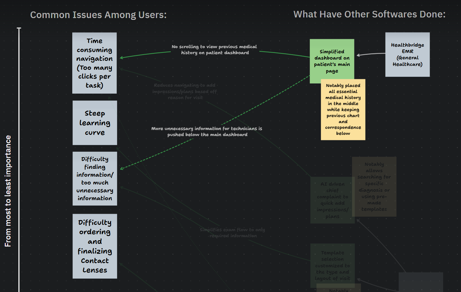
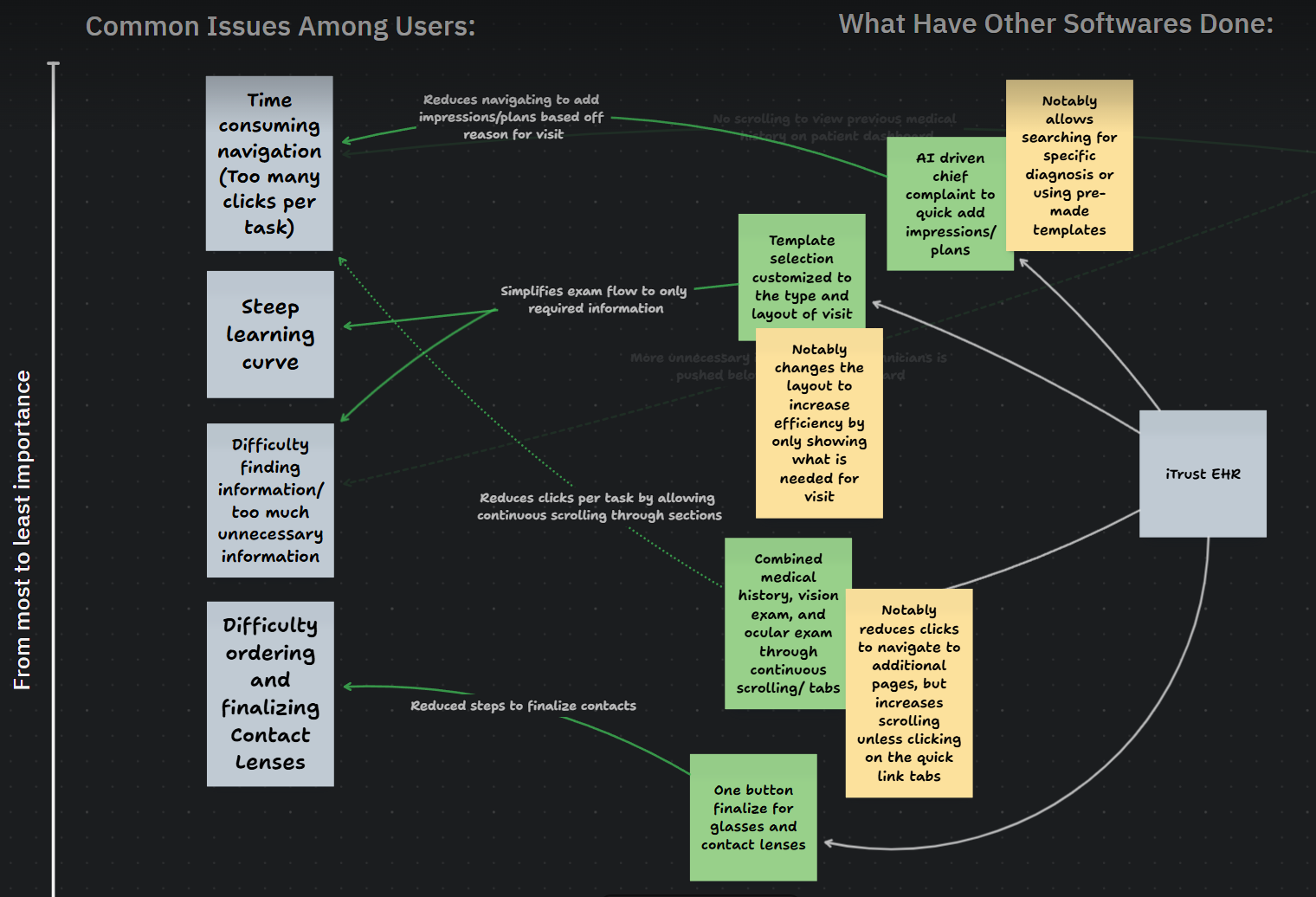
In obtaining research through user reviews I narrowed them down to the most common pain points being: time consuming navigation, steep learning curve, difficulty finding necessary information, and difficulty ordering/finalizing contact lenses. Widening my view on the website I took to other softwares that have developed solutions to these pain points. The two highlighted softwares were Healthbridge EMR and iTrust EHR.
Overview of pain points
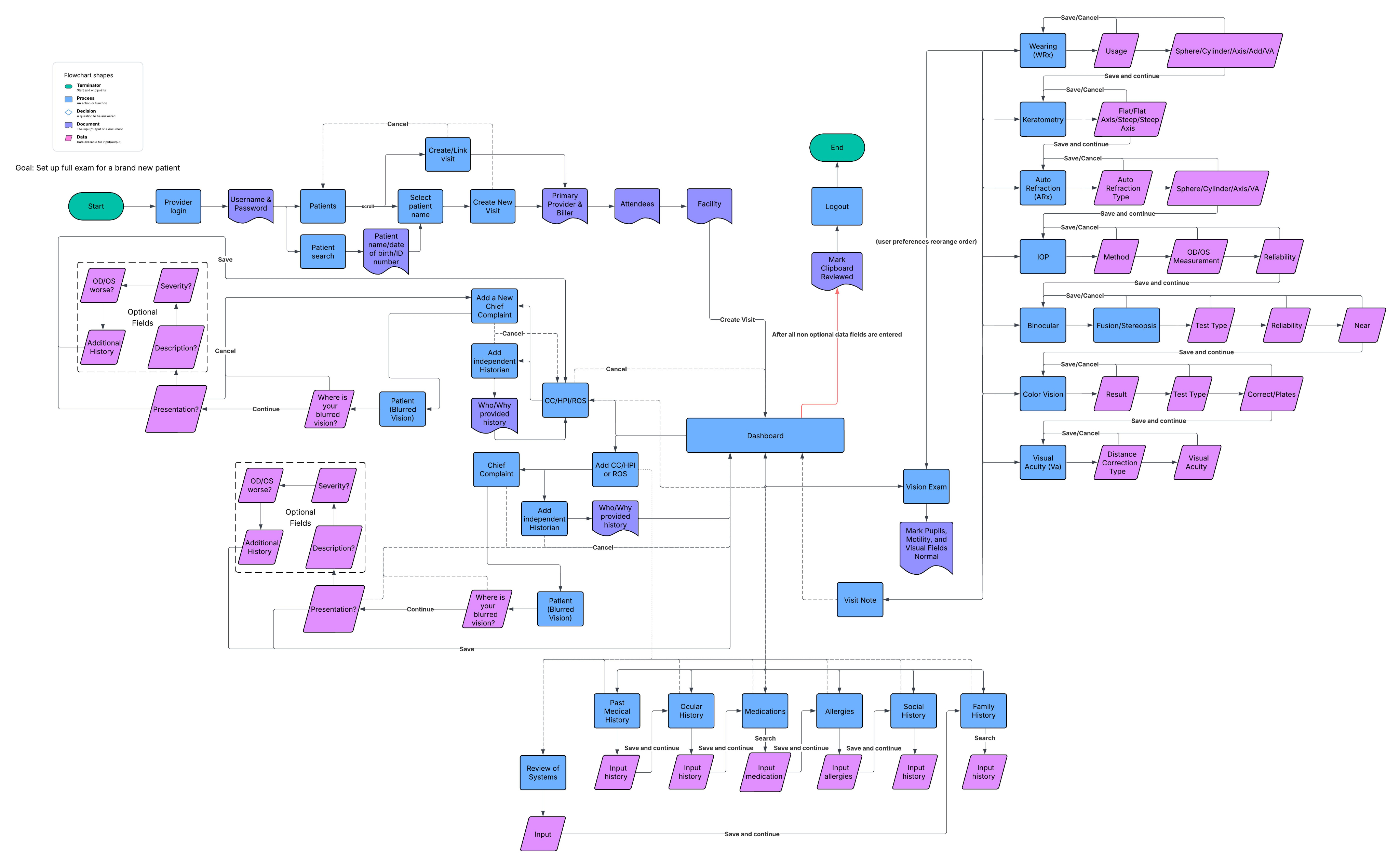
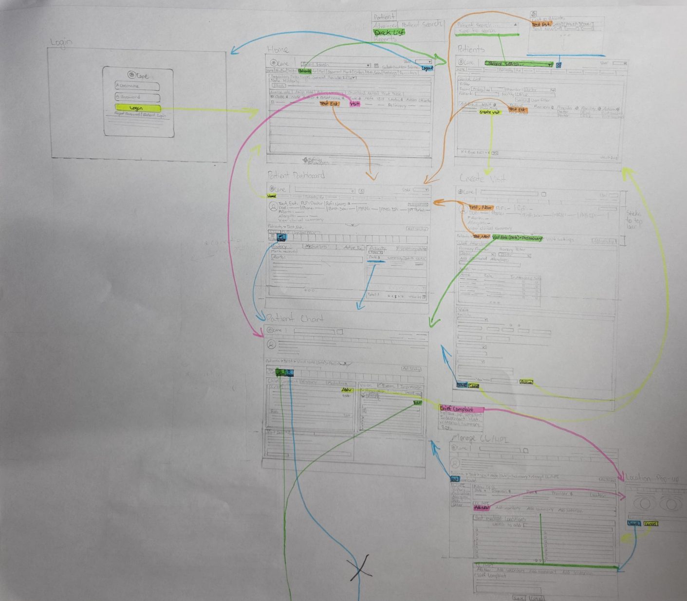
Flow chart involving all tasks
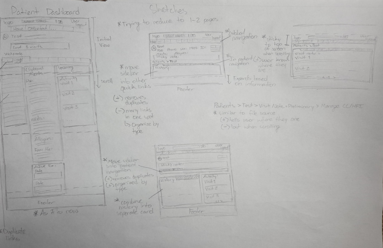
These softwares revealed the addition of both AI-powered templates grouping sections based on similarities which was very applicable to my project. This took me into the design portion where I had to keep it similar to the previous design in order to keep familiarity. By laying out the task flows I was able to sketch out changes that could be made to the existing structure.
By organizing the patient dashboard and relevant areas where the user would have to input data they had less screens they would have to navigate through. Inputting the patients primary reason for the visit would show templates/plans associated with the reason. Using the template would narrow the unnecessary information that would normally be displayed giving easy access to appropriate task flows. Then the remaining input fields would be easy enough to scroll through sections without having to click individually to move forward.
Sketches of patient dashboard, chart view, and manage cc/hpi
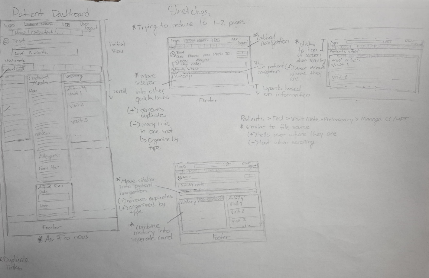
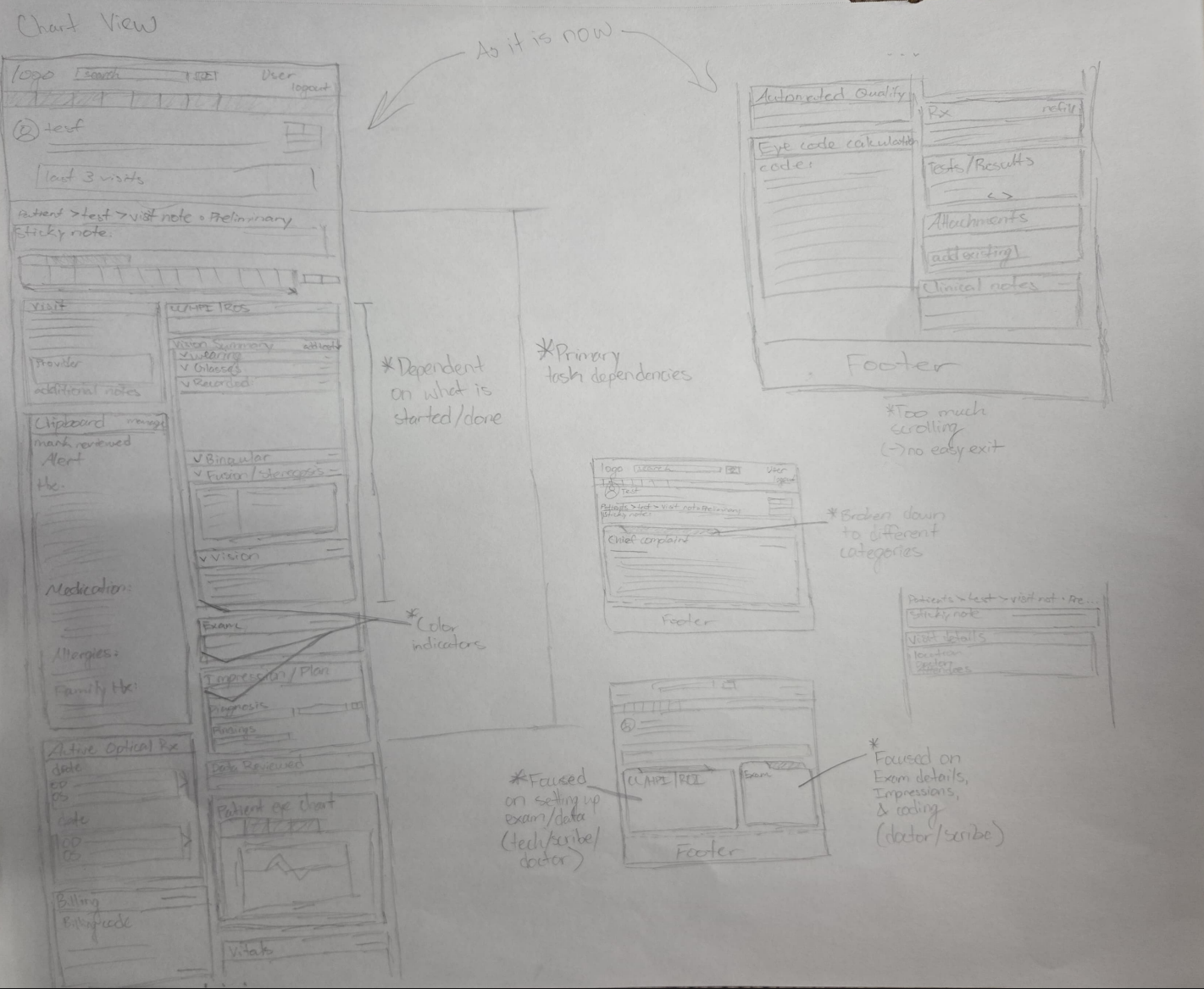
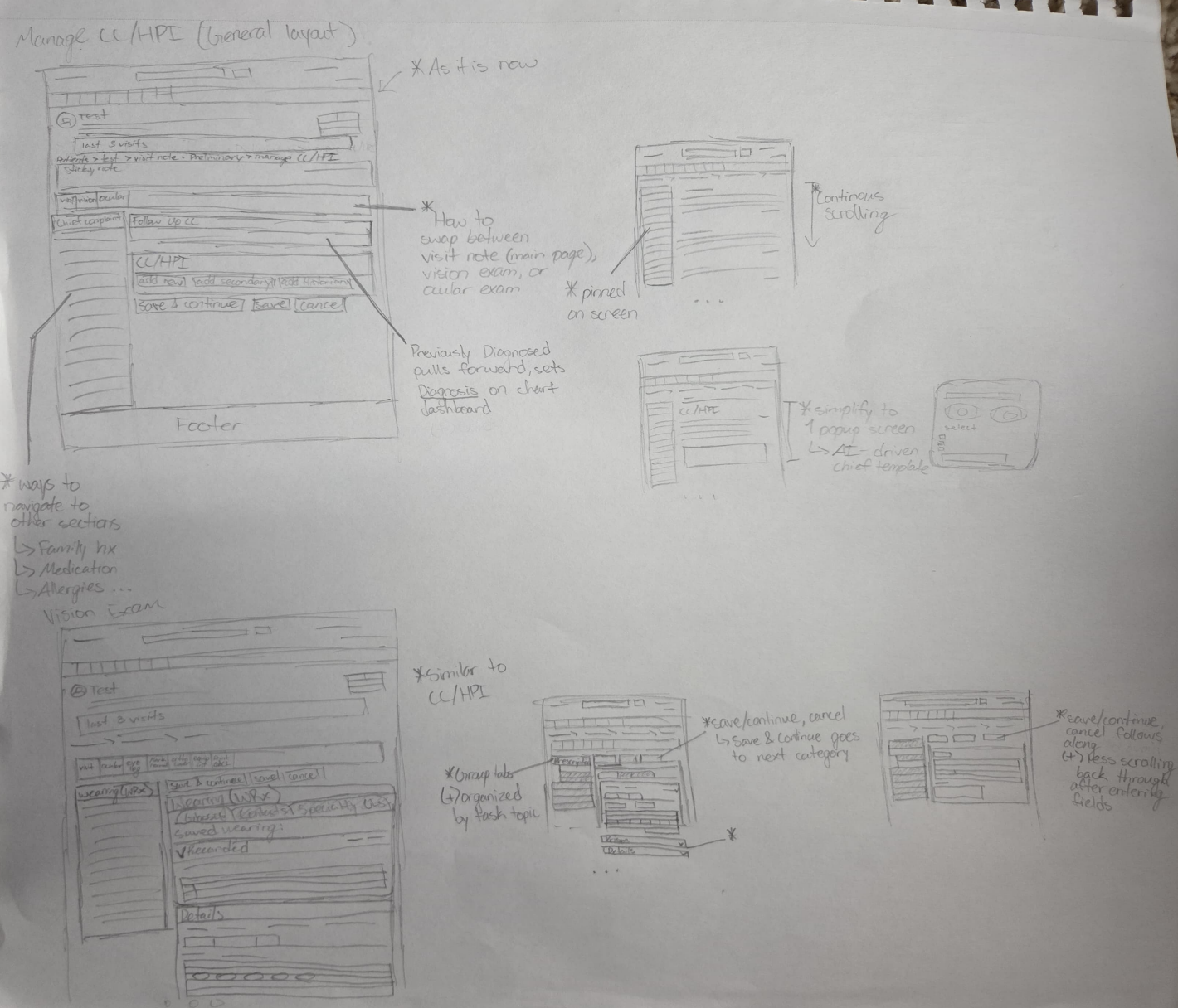
Sketches of patient dashboard, chart view, and manage cc/hpi
Following the design was setting up the prototype to be tested on actual users. At the current moment there is no testing on users due to complications in accessing users outside of my circle to remove bias. In trying to communicate with other businesses that use EHR Eyefinity Encompass I was either turned away or told that they did not use the same method of electronically charting. With a new plan made with my professor at the time that will be completed by the end of Summer 2026.
General wireframes
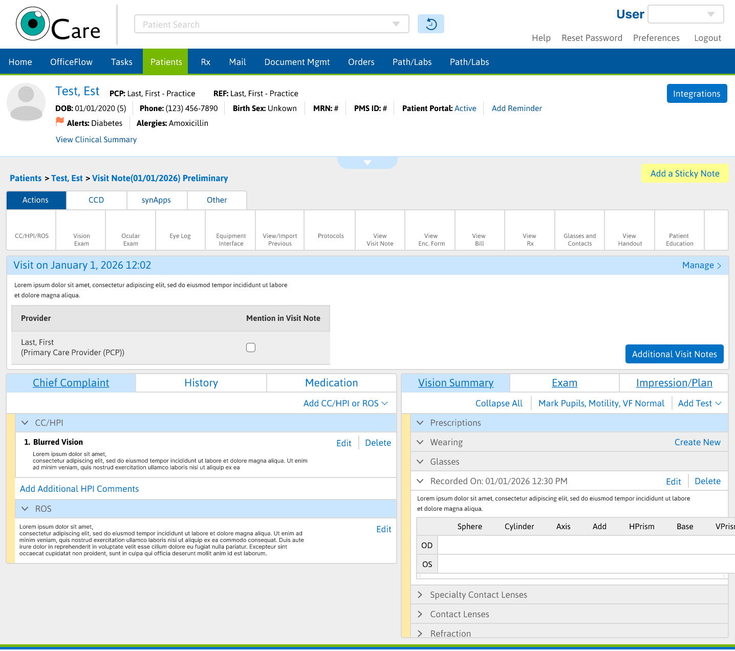
Carrying on I was forced to move forward in completing the high-fidelity prototype with the current research I had. Learning from previous projects I was able to create a high quality prototype including the previously mentioned solutions. Keeping the original design scheme intact the proposed solutions show grounds of saving the user time and giving greater satisfaction when completing a task.
Overall there were a lot of hiccups during the design process that made me pivot to design what I could without breaking things like HIPPA. With many levels of users there is a lot of information that has to be accommodated for. I am excited to test the proposed solutions to see what impact this redesign has compared to the current version.
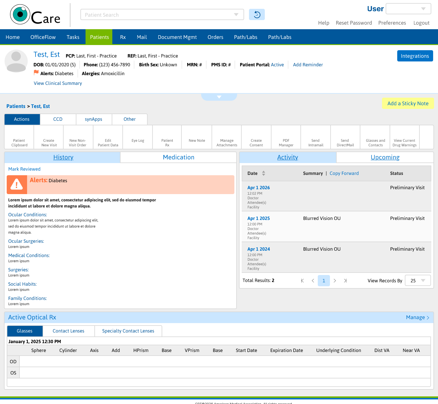
High-fidelity prototype of patient dashboard and chart view